signup_prompt_title
signup_prompt_description
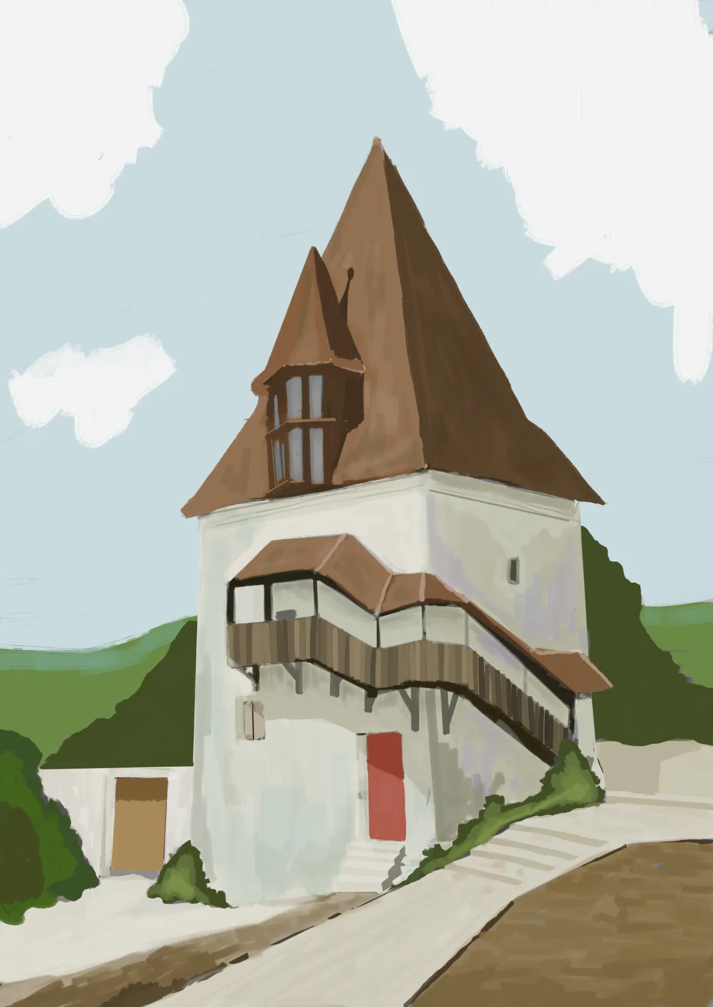
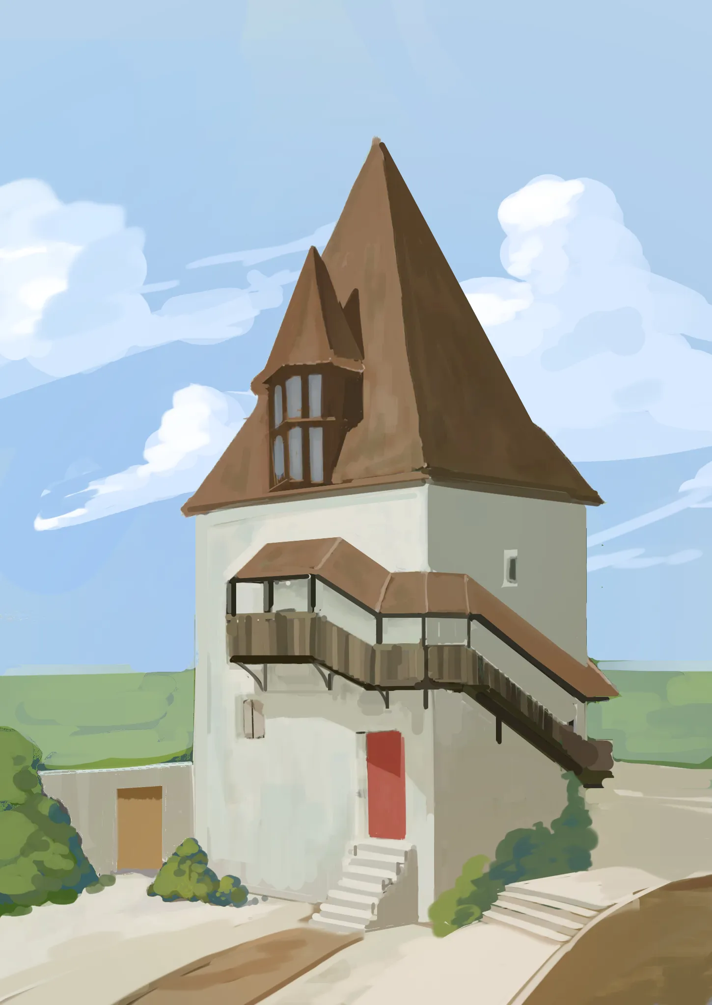
artwork_paintovers
artwork_paintover_notes
artwork_paintover_notes_prompt_title
artwork_paintover_notes_empty
recommendation_heading_also_help_prefixrecommendation_topic_environmentrecommendation_heading_suffix
recommendation_subtext_environment_help, recommendation_subtext_suffix
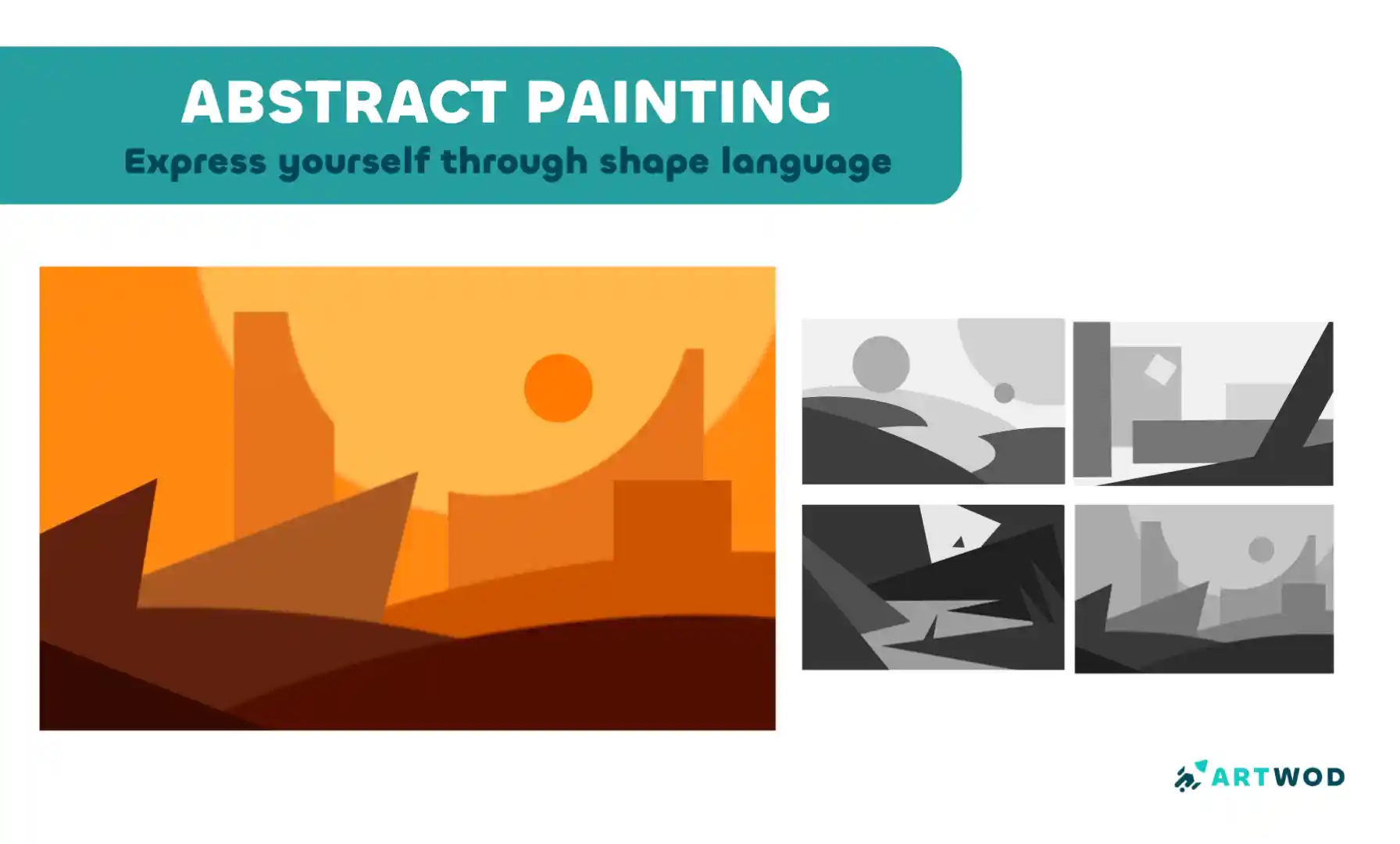
Abstract Painting Techniques: Unlocking Creativity with Color and Form
Master shape language and value composition through a six-step exercise combining rectangles, triangles, and circles to build stronger design instincts.
Environment
related_unanswered_title
Rendering
card_no_responses
Magic Lessons, One last Try
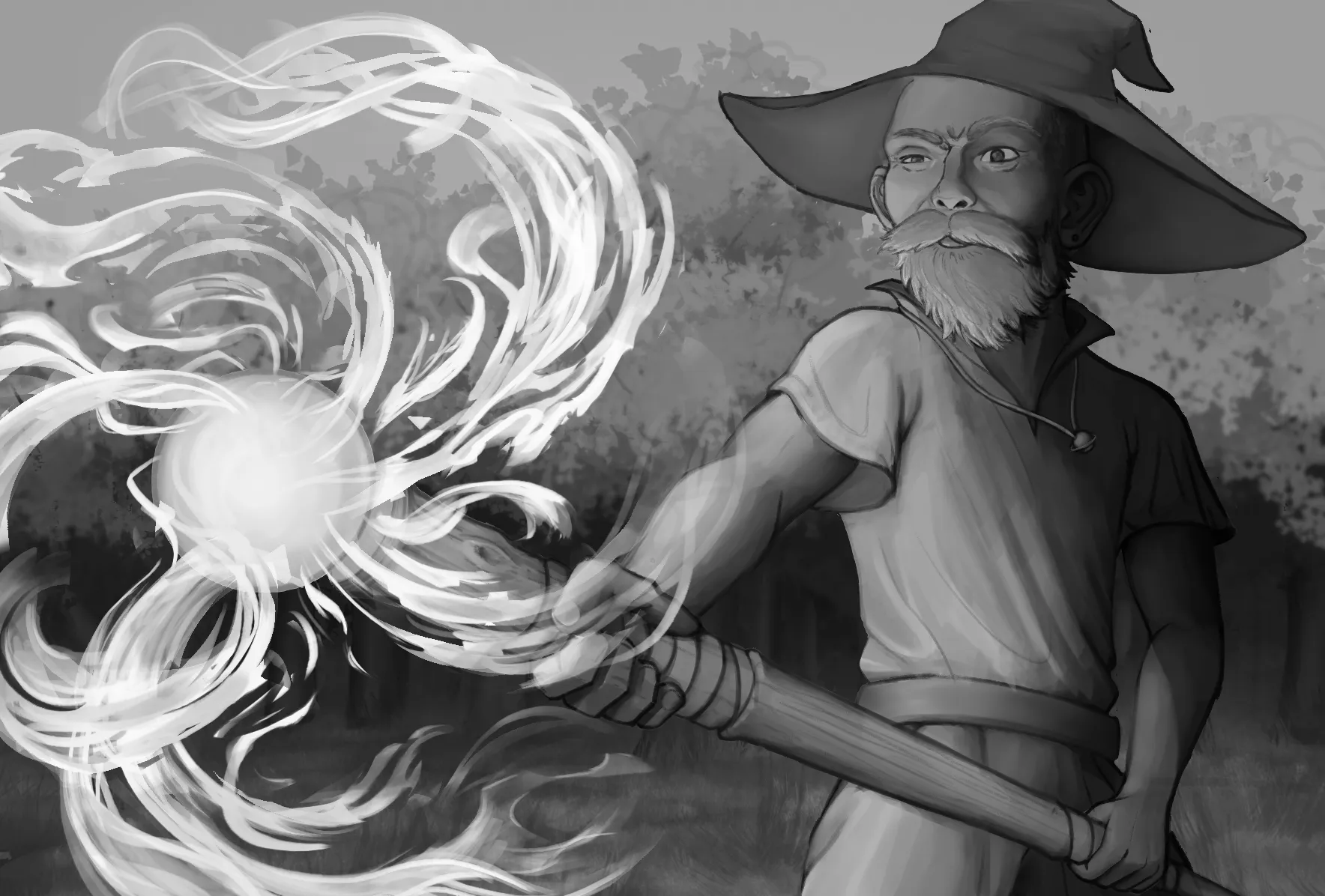
For this piece my primary focus was on Values and Rendering. I got to this point and felt stuck not sure what direction to go with it. I wanted to achieve a more dynamic energized feel. Any other feed back is also welcome! Oh, the eyes were intentional, I wanted him to look like he was wincing, though I'm not quite sure I pulled off that effect haha
card_hours_ago_plural
card_view
Portraits
card_no_responses
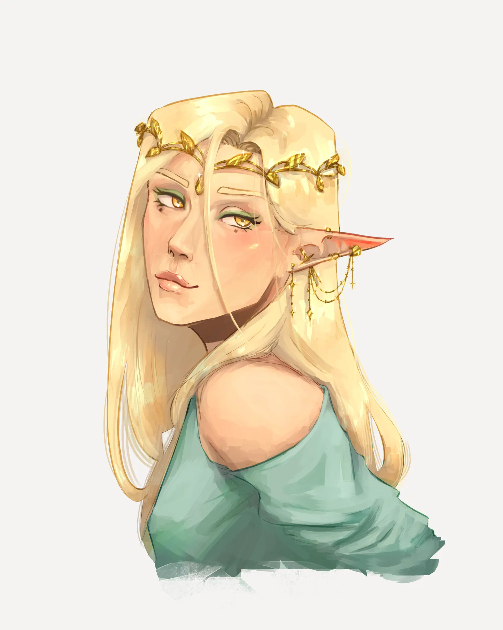
D&D Portrait Help!
A revision based on the wonderful feedback I've received so far! Tried centering her nose and mouth more, changed the angle of the hair strand, upped the contrast/lowered the brightness, and tried to define her facial planes better. I'll be honest though I have no clue what I'm doing with her clothes haha! So any extra advice on drapery and rendering clothing would be appreciated! I feel like right now its too high contrast compared to the rest of her and its a little distracting.
card_hours_ago_plural
card_view
August Smaugust Challenge
card_no_responses
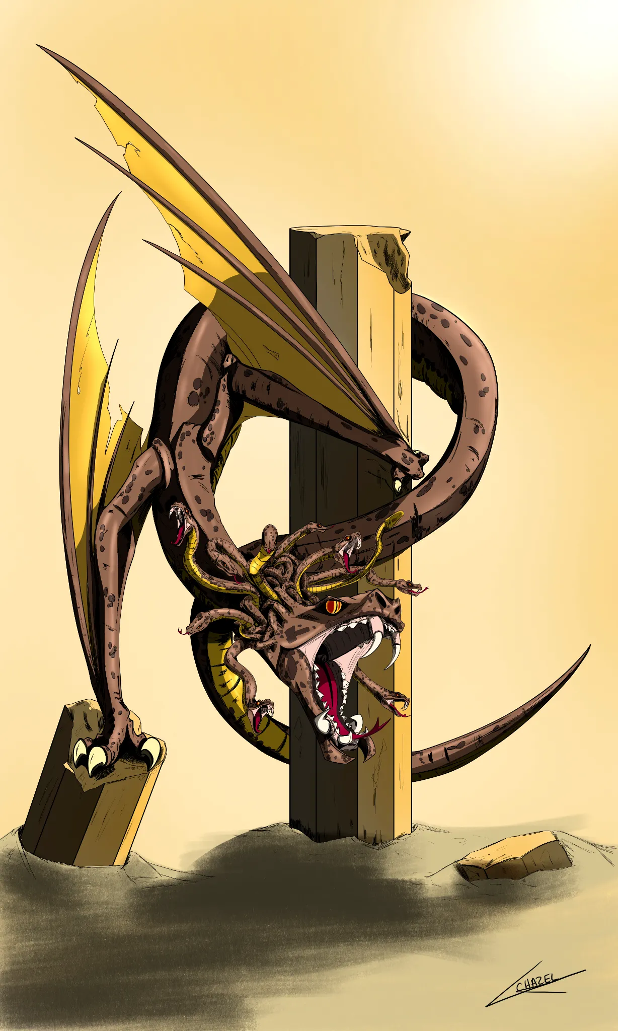
The Gorgon Dragon
After a lot of hesitation, wondering whether I had really finished this drawing and whether it was good enough to enter the contest… I finally decided to post it. 😅 Even if I don’t win the contest, that’s okay. What matters most to me is that I saw my idea through to the end and managed to bring it to life the way I had imagined it. And for that, I’m really proud to present my dragon: “The Gorgon Dragon.” 🐉 For this artwork, I was inspired by the famous Gorgon from Greek mythology: Medusa. She’s a character I particularly love. I find her mysterious, fascinating, and captivating… with, of course, one small detail that can become quite a problem: her gaze. 👀 So be careful… if you meet my dragon’s eyes, you might just end up turning to stone! 😉 And most importantly, don’t hesitate to zoom in on the artwork to discover all the little details I’ve hidden throughout the drawing. 🔍 Thank you to everyone who takes the time to look at my work, and good luck to all the participants of the Smaugust Challenge! ❤️
card_hours_ago_plural
card_view
Portraits
card_no_responses
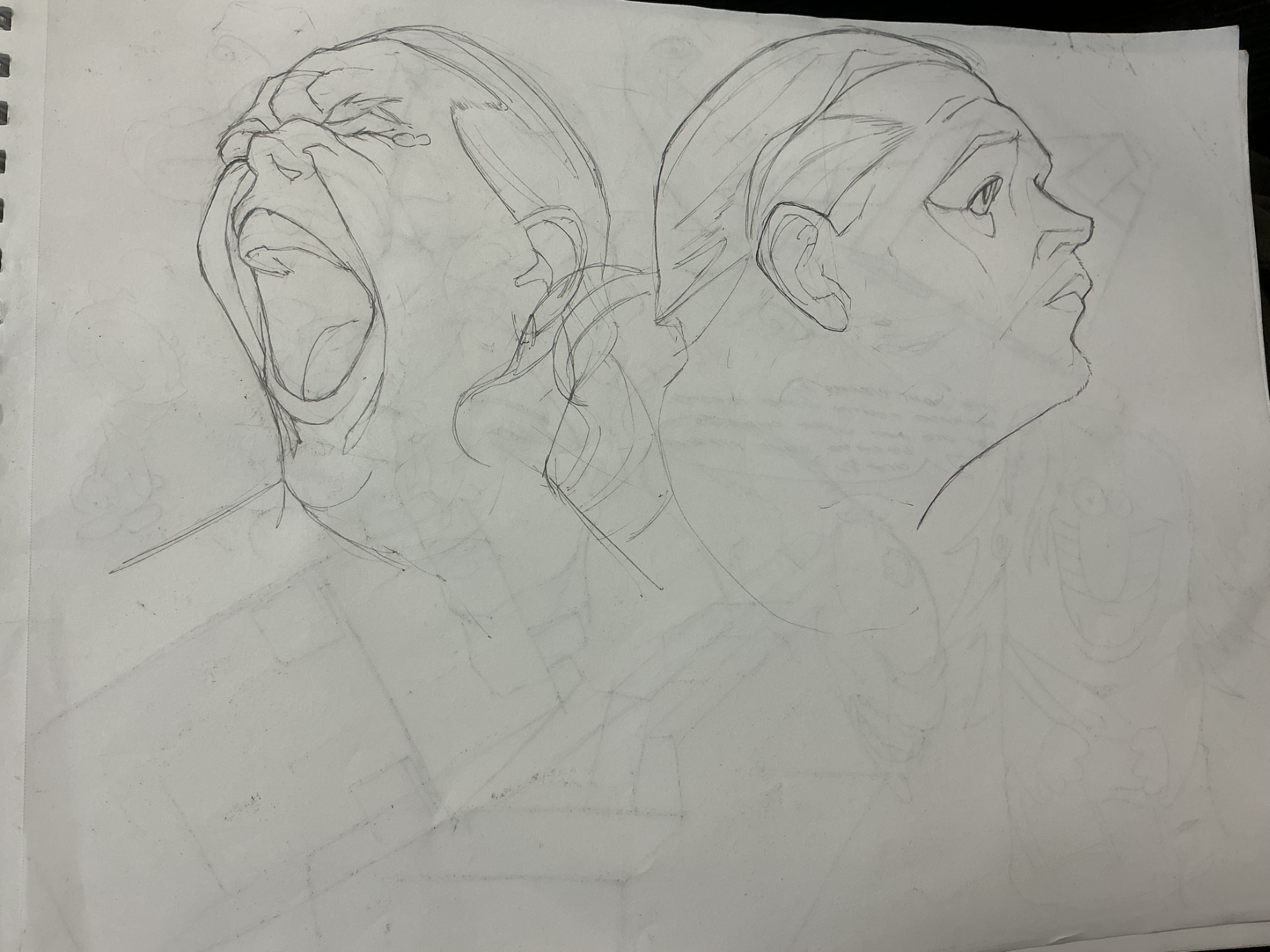
beeg yawn
yoyoyo guys what's up? peep the new pfp, what do you think (guys go watch look back ITS SO PEAK)? anyway, here's a new entry in my sketchbook. It's a stylized portrait from reference, neat right? well, nobody cares about that, I WANT FEEDBACK! so, if anyone has any suggestions at all on what i can do better on this one (silhouette, facial structure, likeness), please let me know!
card_hours_ago_plural
card_view
Anatomy
card_no_responses
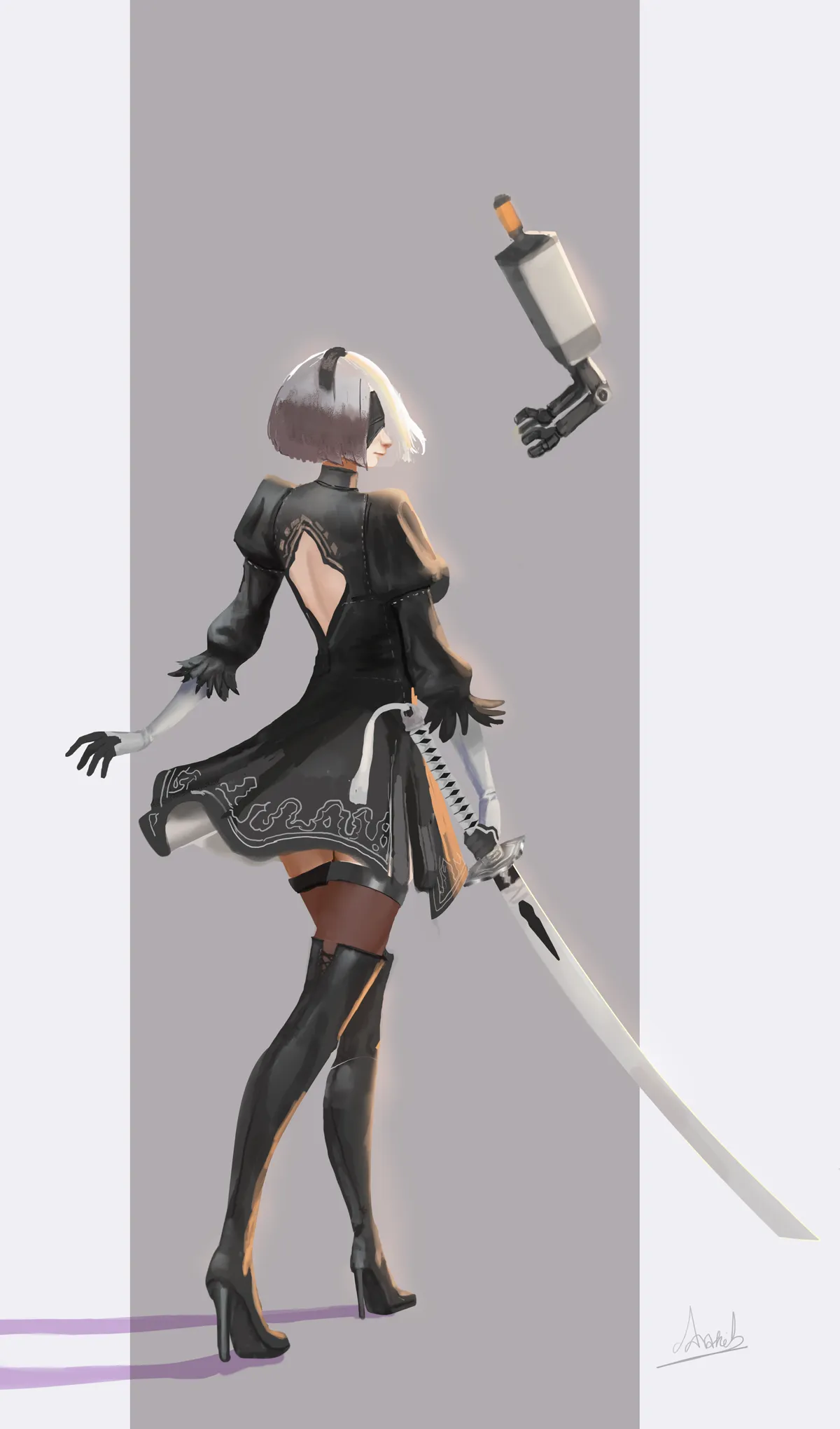
2b illustration
i would like to know what i could improve here. what other details or fixes i could add
card_hours_ago_plural
card_view
Anatomy
card_no_responses
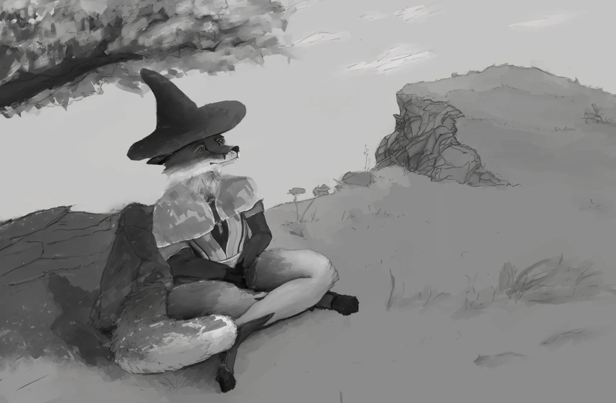
Hangin Out
Upon reflection and close inspection I noticed that I made the head too big previously because I wanted the hat to be big too but I got distracted by it, also I revised the anatomy, I believe is more correct now, the arms are longer, the legs are slightly longer and posed more naturally because these legs cant bend the way they were before, might still need further changes, also revised the tree and started to add the shadows that are produced by the tree, I am aware that I need to adjust the shadow of the character since now is in shadow. I would still greatly appreciate any feedback or tips regarding anatomy or any other area in this piece, thanks you
card_hours_ago_plural
card_view
Figure
card_no_responses
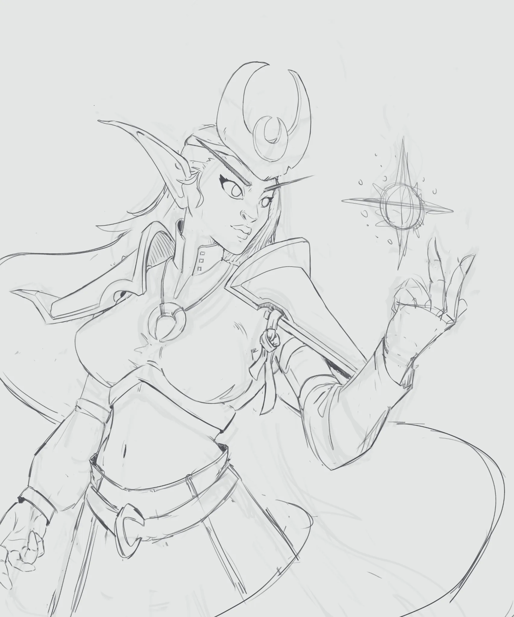
Elf Priest
Hey, so i decided that i wanted to do more of my art, that wasnt strictly practise all the time. But rather practise while making some art. So i am trying to make some illustrations for once. Its my first attempt at this and my first attempt at drawing a females tbh 😅 It would be nice, if you had some feedback before i tried tightening up the lines 🙂
card_hours_ago_plural
card_view
Rendering
card_no_responses
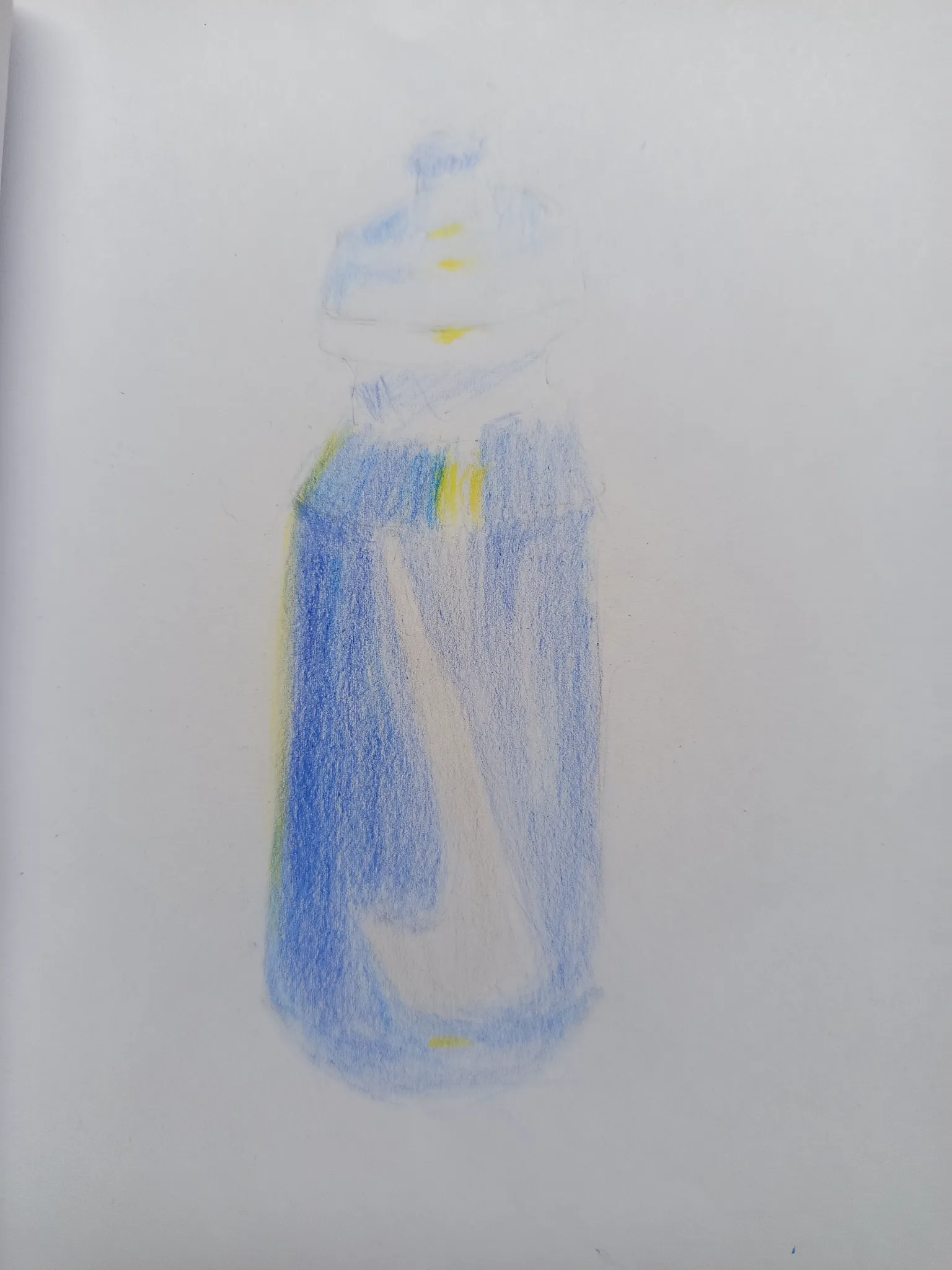
A bottle
Still work in progress, i think its doing fine....
card_hours_ago_plural
card_view
Figure
card_no_responses
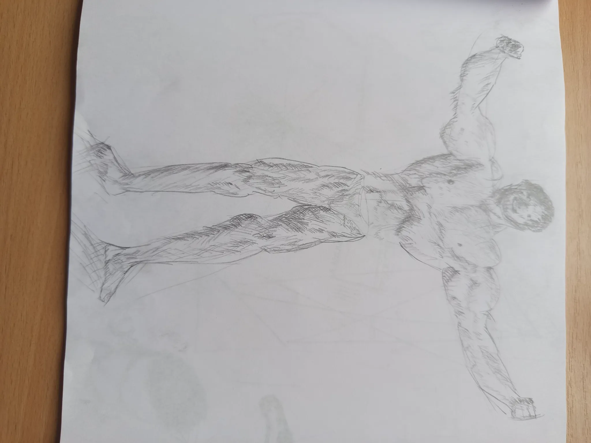
Bodybuilder
This is my drawing of a bodybuilder, i was studying the human figure and decided that its time to give me a chalange( ps: first time doing cross-hatching
card_hours_ago_plural
card_view