signup_prompt_title
signup_prompt_description
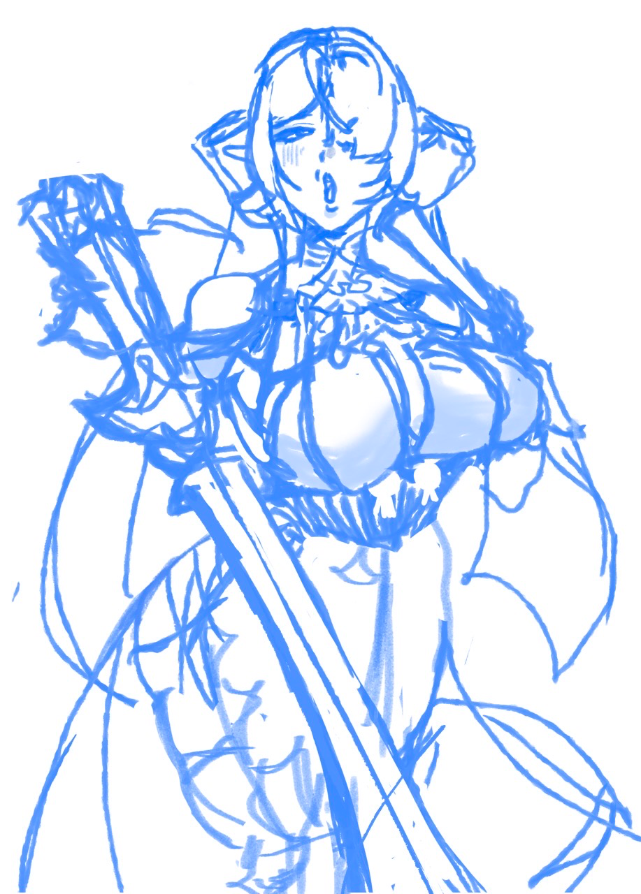
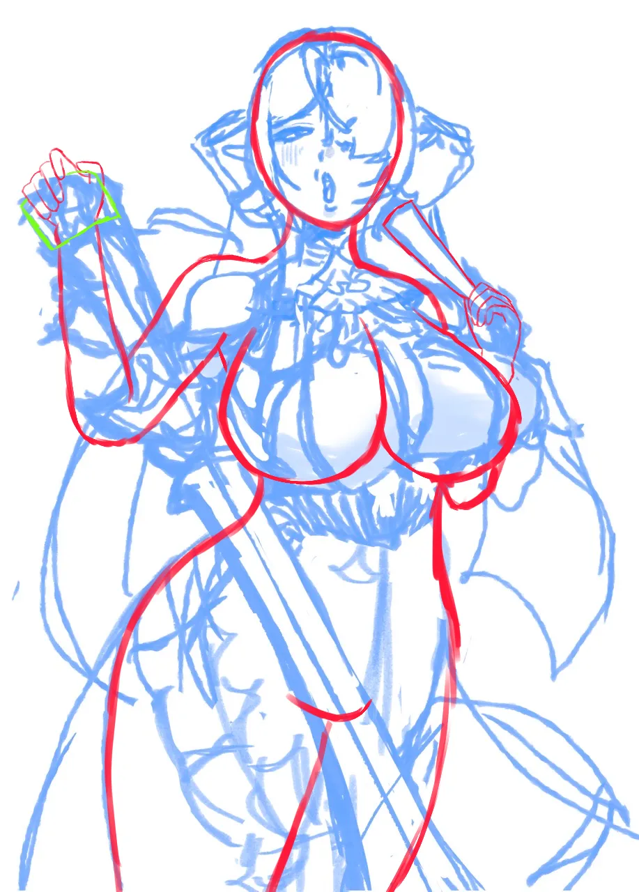
artwork_paintovers
artwork_paintover_notes
artwork_paintover_notes_prompt_title
artwork_paintover_notes_empty
recommendation_heading_also_help_prefixrecommendation_topic_defaultrecommendation_heading_suffix
recommendation_subtext_default_help, recommendation_subtext_suffix
Easy Art Pen & Ink Rendering Techniques
Master pen and ink rendering through four progressive exercises: build value scales, shade basic forms, study organic objects, and create imaginary inventions using texture and light.
Challenge-of-the-month
related_unanswered_title

Anime
card_no_responses
any suggestions on this character design?
so i'm figuring out what i'd like to be the final design for my oc sebastian, and i did this illustration of him with his pet peacock. i have some ideas on where i'd like to take his design, but i'm also interested to hear more of what people think i should consider altering or editing to help the image read as fun, colorful, friendly, and welcoming. i'm glad to received feedback on basically anything (including light/dark values and contrast, color choice, lineart style, anatomy, gesture, silhouettes, posing...literally anything art related that you think could help the design). thanks so much for your help ❤
card_minutes_ago_plural
card_view
Rendering
card_no_responses
Oc Artwork
I feel like the rendering is off in some area, please help
card_hours_ago_plural
card_view
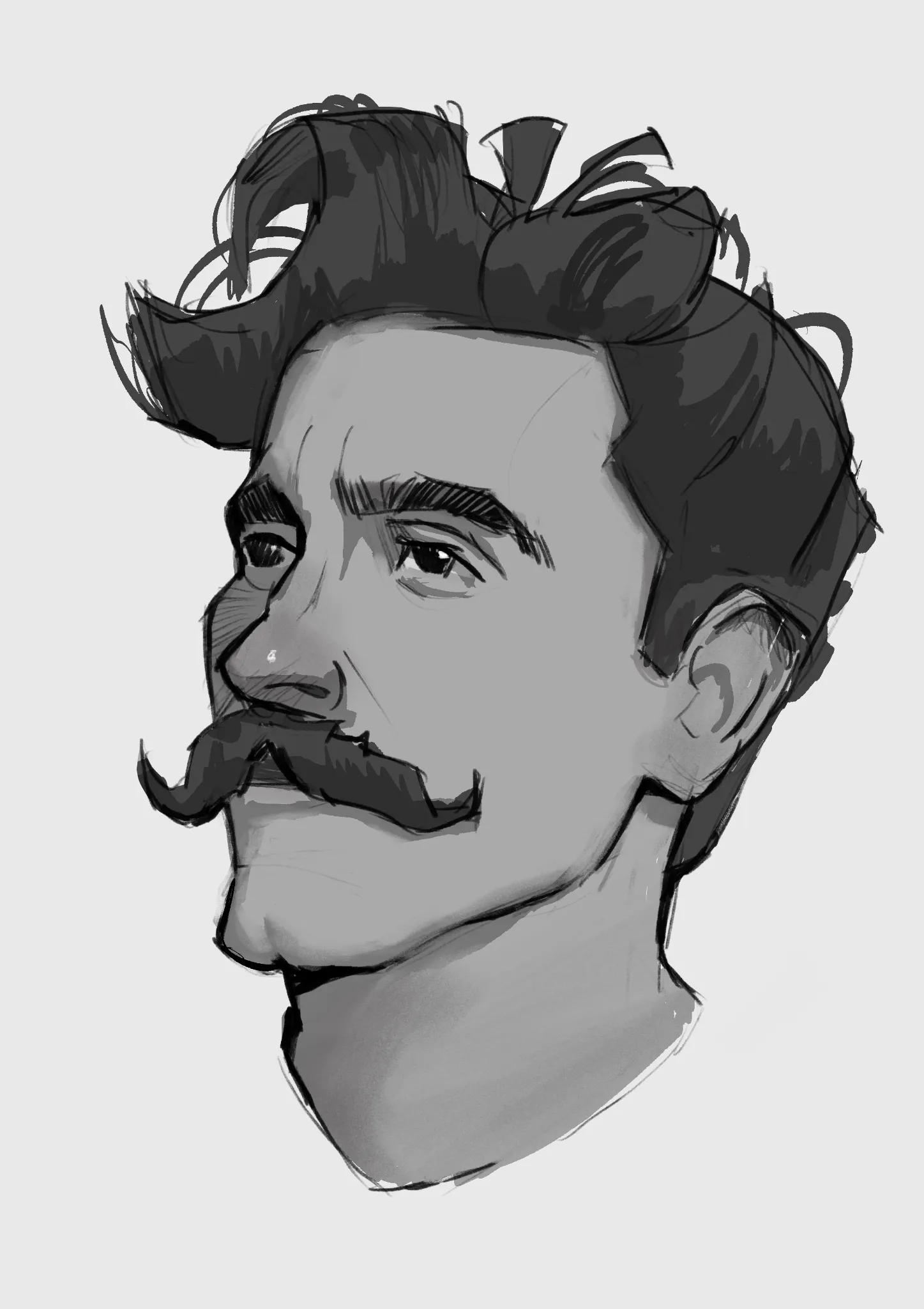
Portraits
card_no_responses
Portrait
Stylized vesrion
card_hours_ago_plural
card_view
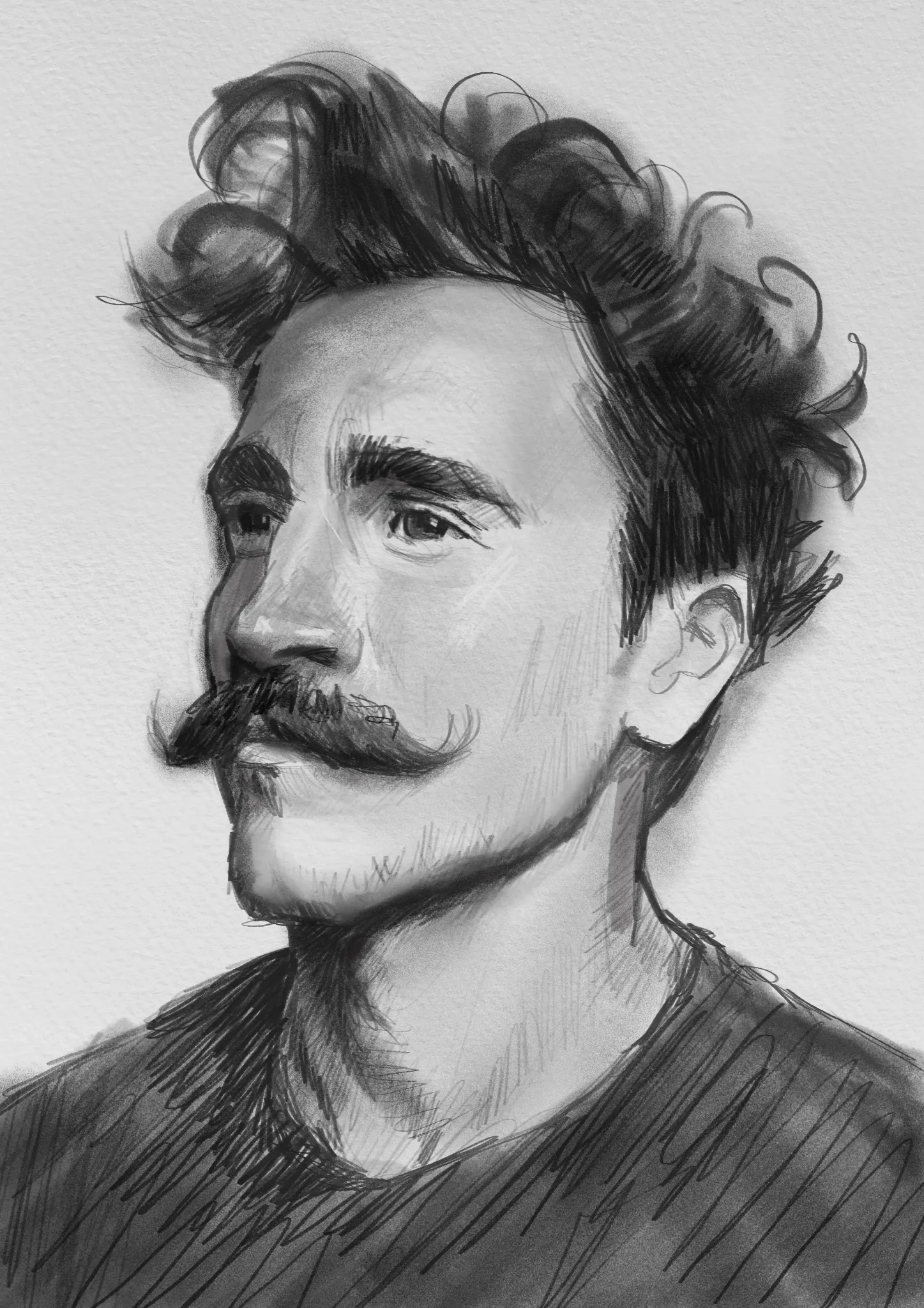
Portraits
card_no_responses
Portrait
Adding more contrast to the shadow side.
card_hours_ago_plural
card_view
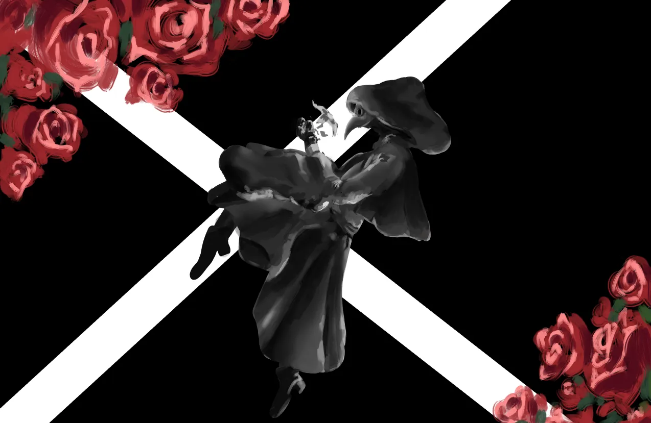
Rendering
card_no_responses
plague
did some stuff, idk what i did just tried to darken it, ignoring the backround here, i was wondering how icould seperate the values betwen the cloak and the arm thingy better and make the plague masks values seem more refined looking rather than a bunch of random strokes, idk if i should just use less values since its far away or if its just an edge thing, and id apreciate general advice how to make this more polished
card_hours_ago_plural
card_view
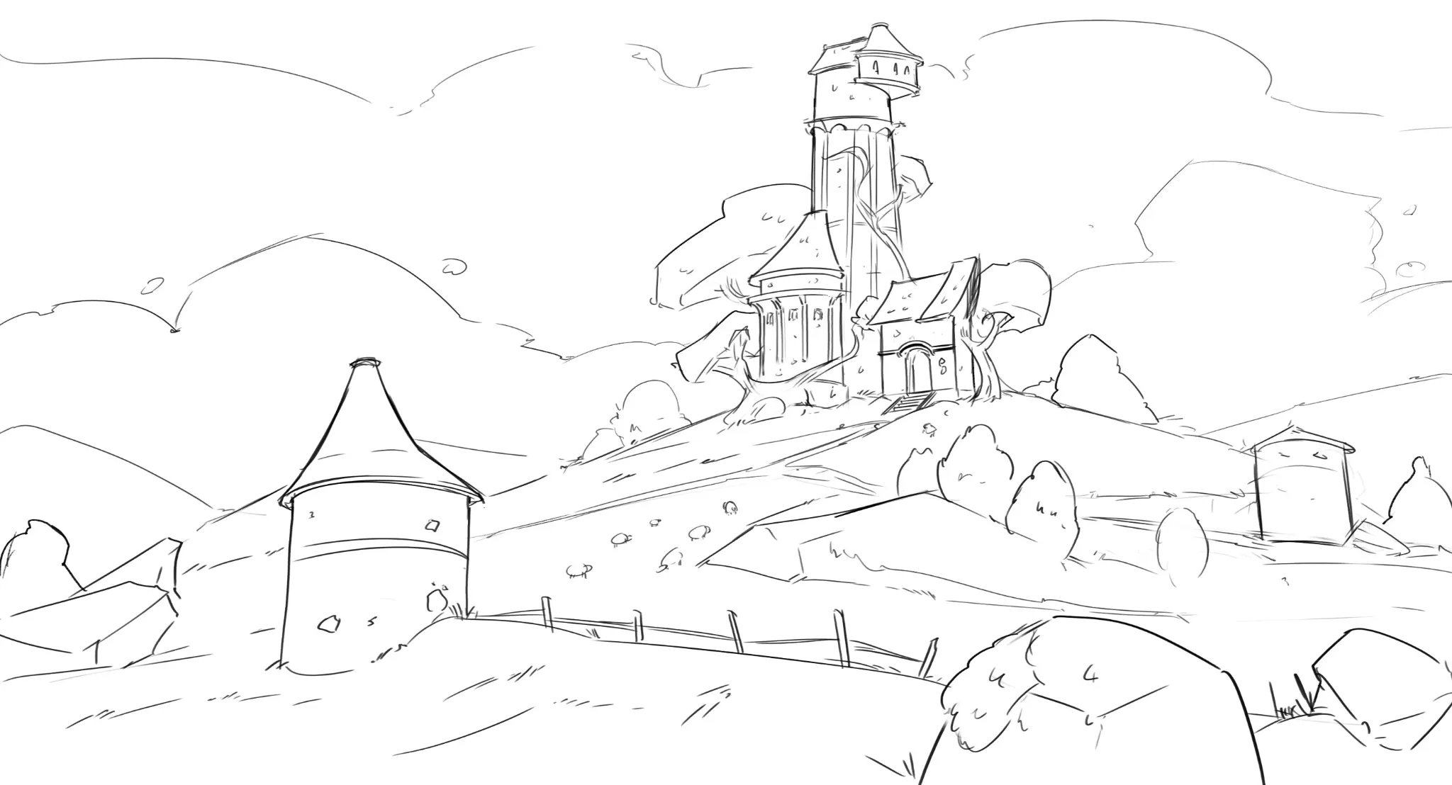
Environment
card_no_responses
House sketch
Hello everyone! I want to polish this and get rid of all the flaws!
card_hours_ago_plural
card_view
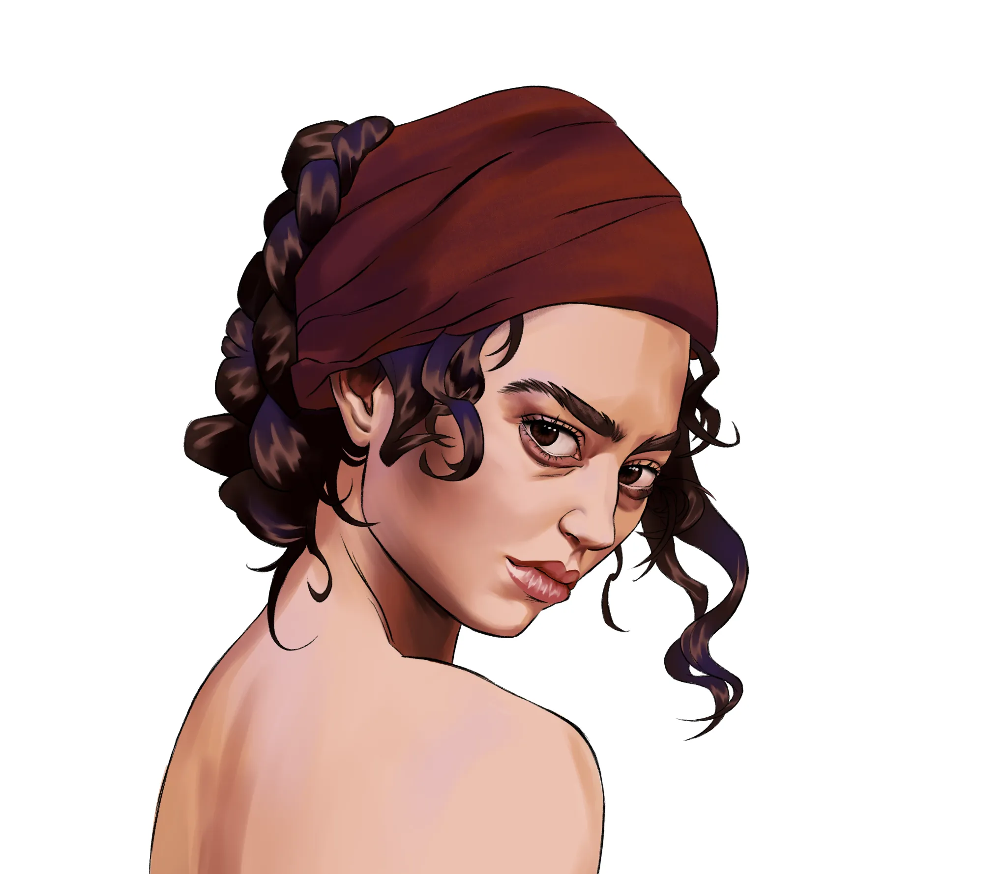
Rendering
card_no_responses
Independent work
Hi! I have started my journey into digital rendering a couple of weeks ago. This is my latest drawing. I would like some help to understand what i'm doing right and what i could be doing better. All tips are appreciated!
card_hours_ago_plural
card_view
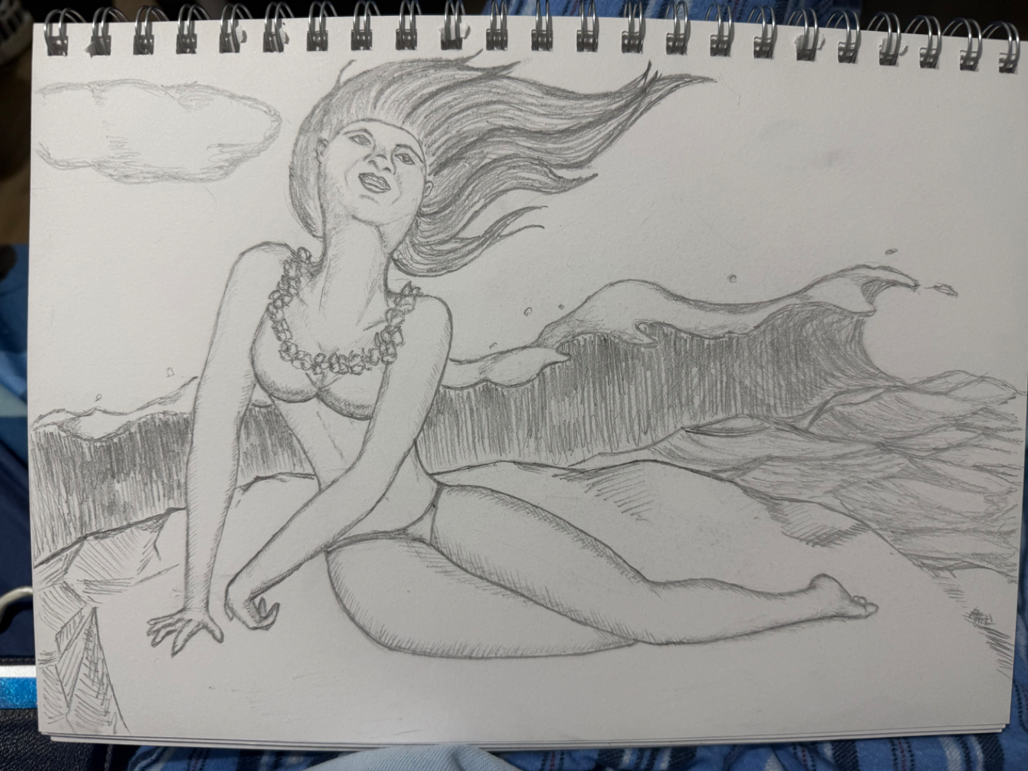
Figure
card_no_responses
Practice
I had a hard time with this sketch. Can someone advise on any tips with the angle of the head? Also, any advice on how to properly replicate the texture of the ocean/wave would be very much appreciated.
card_hours_ago_plural
card_view
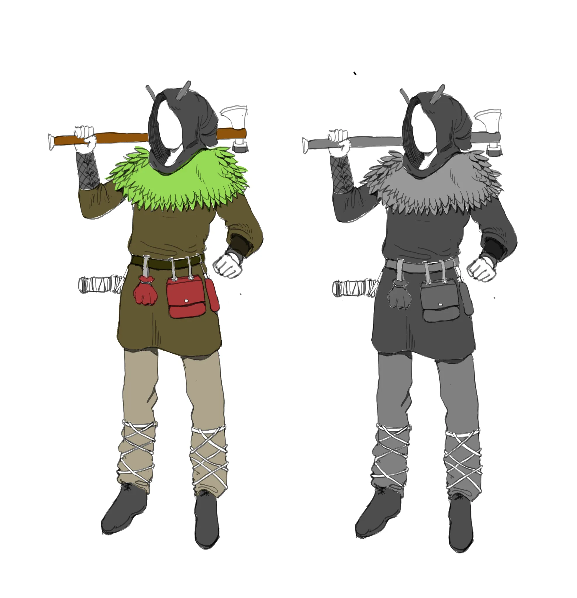
Perspective and Form
card_no_responses
The woodland scout
i think the pose is off primarily the arm thats holding the axe. other than that, i wanted to know what is lacking here that a professional would have. i would have rendered it more but i feel like its off already at this stage. usually i would explore many ideations before going into detail but i wasnt sure if i could meet the quality so i made this. (also i have no idea what category to put this in)
card_hours_ago_plural
card_view