hub_layout_hint
#331
profile_stat_rank
2
profile_stat_upvotes
profile_stat_critiques
100%
profile_stat_helpful
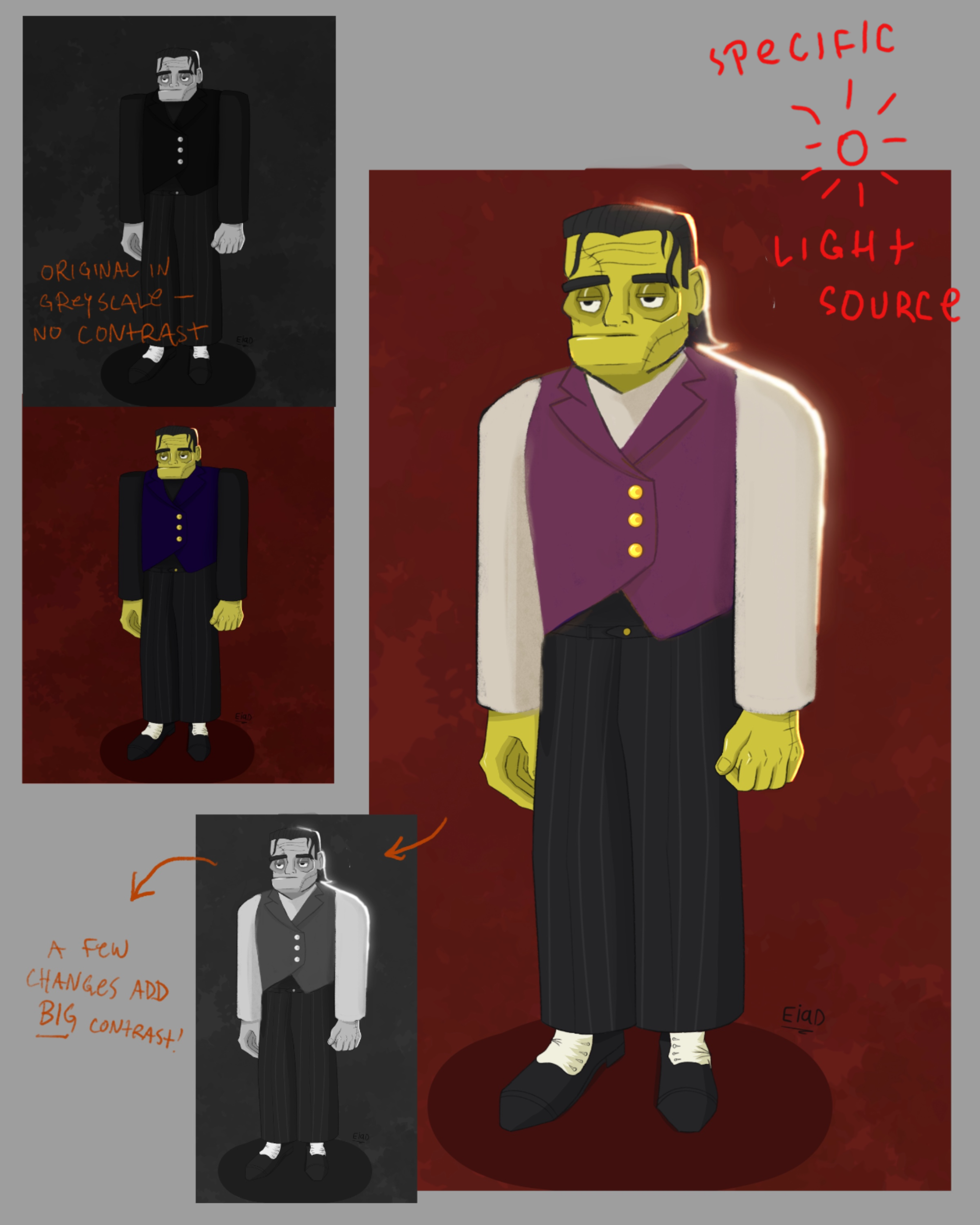
“Unless your goal is realism, I wouldn’t worry too much about your colors being off. Keeping your values readable is much more important in illustrative work. I think the saturated pink and blue look q...”
“Hi! I think it’s great you’re re-imagining the design of such a classic character. I think the reason this design feels ‘flat’ is two-fold - your values are too alike, and the posing/shape language is...”